
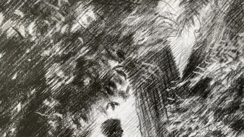
Creating The Venus of The Hague – 24-06-20
Sales info: original (if not sold), prints & printable) - visit my website:
Website link: https://corneakkers.com/2020/06/24/the-venus-of-the-hague-24-06-20/
Printable: https://corneakkers.com/product/printable-the-venus-of-the-hague-24-06-20/
My Next Move
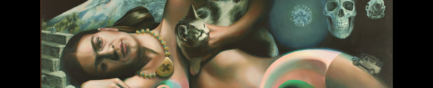
This graphite pencil drawing ‘The Venus of The Hague – 24-06-20’ is my next move on my Venus trail. My last one was quite angular. Consequently I asked myself this question. Should I decided to do another surrealist one ? Hitherto I think I have covered everything abstract I wanted to express and surrrealism seemed a natural choice. Or wait a minute, why not combining a couple of abstract styles with a surrealist touch? That would be jolly good fun, wouldn’t you say?
Throwing in Earlier Themes
I put in some of my earlier themes like ‘singularity’, ‘the golden ratio’. Maybe combining them with ‘the collapse of the wave function’. Lately I am all about incorporating elements of the implicite order as defined by David Bohm. All lighter and darker toned planes are designed to support aforementioned themes, working the subconscious mind of the spectator. Some see desert trails, some see body parts. Others can enjoy the reference to physical laws and perhaps a few can fathom what deeper meaning lies within.
Radha Mitchell
Since there had to be one in the scenery as well I chose a personal favorite: actress Radha Mitchell. In my eyes she represents the pinnacle of beauty. Obviously the latter is the sheer consequence of applying the golden ratio. The blonde bob haircut however shows dark tones and such symbolises nothing is what it looks like. Next to this, why not situate her as a makeshift Sphinx in a desert. A desert naturally is a pool of secrets to discover. Perhaps when you look enough at this drawing the secret of the universy and way beyond will be revealed. What do you think?
Graphite pencil drawing (Sakura 0.5 mm, 4B) on Winsor & Newton Bristol paper (21 x 29.7 x 0.1 cm) - A4 format)
Artist: Corné Akkers
10
views
Creating Model Session – 28-05-24 – 2
Sales info: original (if not sold), prints & printable - visit my website:
Website link: https://corneakkers.com/2024/05/29/model-session-28-05-24-2/
Printable: https://corneakkers.com/product/printable-model-session-28-05-24-2/
Turn Your Back
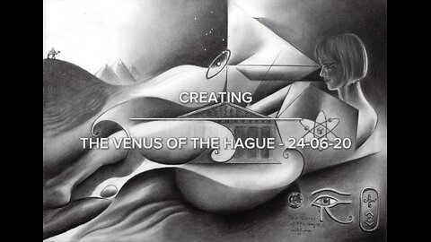
This pastel drawing ‘Model Session – 28-05-24 – 2’ is the second one I made during this month’s session. Still no heater needed and after half an hour rest we held the second session. Unfortunately there wasn’t a blanket available to have her recline on. However, most people were up for another sitting pose. Other didn’t want to do a standing pose. Why not have her turn around. Let her sit her in front of participants who did her back during the first session. So we did and I immediately got intrigued by the squareness of her figure. She had her legs wide open, forming a square and a bit from behind. Next to this I liked the play of light and dark. Such is visible on the left side of the table. Some people decide to ignore them perhaps but these are hidden gems I gladly incorporate in my work.
Tonal Play
Contrary to the first session there was much more darkness on her back than on her front. Consequently I could use more of my Conté Carré black chalcks. Not too much though. The challenge was to capture tones slightly darker than the midtone gray blue that already was in the paper. Next to this drawing her foreshortened arms, fingers and feet was great fun. Evidentially I didn’t needed much. Only some highlighted points really. The stress in this drawing obviously lies in the structures in the back. I always like these kind of positions. During this one she was moving back and forth a bit. Not noticeably but just enough to have her back capture razor light. Now there was light on her shoulder blade, then again hidden in the dark. What a wonderful struggle for an artist: which tones should I draw?
Pastel drawing on Hahnemühle Dürer Ingres-Bütten Night Blue paper (48 x 62,5 x 0.1 cm)
Artist: Corné Akkers
39
views
Creating Model Session – 28-05-24 – 1
Sales info: original (if not sold), prints & printable - visit my website:
Website link: https://corneakkers.com/2024/05/29/model-session-28-05-24-1/
Printable: https://corneakkers.com/product/printable-model-session-28-05-24-1/
A Great Model
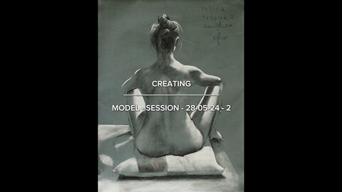
This pastel drawing ‘Model Session – 28-05-24 – 1’ is the first one I made during this month’s session. Lucky for us, we found the heater back but we didn’t need it really. The temperature was pleasant enough so the model didn’t need to be warmed up. This time we had the pleasure to welcome model Polina. She is a great model and what struck me is that she is able to sit perfectly stil. And tgatl for one full hour at a stretch! Slender as she is, she showed all the right angles. What I like about ‘De Blauwe Tram’ is the razor light coming from above. Perhaps I didn’t say much about it in my art statement to last model sessions. However, this cannot be underrated. There is always trouble with the lighting in group sessions. Using standing lamps there is always one shining in ones eyes.
Razor Light
Consequently the disadvantage has become an advantage because we can only use the light from the ceiling. Howevver, it casts beautiful razor light structures, creating beautiful pockets of light and dark. Basically I only had to throw in everything light with white Conté carré chalk. With regard to dark structures there weren’t many really. Underneath the pillow she is sitting on I darkened things up a bit. Below her buttocks, thy and calf I drew some power lines. That’s all mostly. I kept her right arm (for us left) open a bit. Through this the body could breathe and communicate with the negative space around it. Nothing more bothersome than to seal off body structures completely. The result is a joyful play of highlights and midtones and some loose darker tones. A fun project and wonderful model of course.
Pastel drawing on Hahnemühle Dürer Ingres-Bütten Night Blue paper (48 x 62,5 x 0.1 cm)
Artist: Corné Akkers
18
views
1
comment
Creating Hortus Botanicus – 26-05-24
Sales info: original (if not sold), prints & printable - visit my website:
Website link: https://corneakkers.com/2024/05/27/hortus-botanicus-26-05-24/
Printable: https://corneakkers.com/product/printable-hortus-botanicus-26-05-24/
Why Not Leiden?
This graphite pencil drawing ‘Hortus Botanicus – 26-05-24’ yet another impressionist view. Since the last one ‘Arentsdorp – 17-05-24’ I thought of doing something similar but outside The Hague. My initial plan was to depict Leiden again, the town where I once studied. It’s not far away from here, some 10 miles north. There is a great bike path and sometimes I wonder why I don’t visit the place more often. Anyway, there was a sound reason of heading there a week ago. There was this annual Japanese Fair along The Rapenburg I would like to visit. Even the weather was nice so went for a little ride.
Memory Lane
Once I got to the fair it was a bit of a let down. Not the stuff I would like to buy and disappointingly no great kimono’s. Only cheap stuff and no fresh products, etc. Since I wasn’t into bowls, books or other paraphernalia I fled straight into the Hortus Botanicus situated behind the Academiegebouw. It must have been 30 years ago since I was there for the last time after I graduated. So definitively memory lane here. Why not go there for some inspiration?
Looking for That Special Spot
Surely I like what they’ve done to the place. There were more gardens and the greenhouses with fascinating plants and trees were more beautiful than I remember. Must have been the fact I have become more receptive to nature than when I was a young buck. So I took a lot of photos. It was crowdy and soon I realized there wasn’t much opportunity to sit right down and do a live sketch. Unfortunately this is not how things go in real life, only in romantic movies on artistic affairs. The bitter truth is you have to find a spot were there isn’t much space to capture the scenery. Like that specific place further down the road near the Observatory. From a narrow path I suddendly had a great view on a big tree. Unterneath there was a beautiful woman caught in the light.
Size Comparison
What struck me was the impressiveness of the foliage in contrast to the comparatively small person. This gave meaning to the both of them. In absence of her the foliage and treescape wouldn’t show their grandness. The leaves were challenging enough. You always face the risk of turning such structures into one big rubble pile. Consequently I decided to use A5 paper. Because it’s bigger than A6 I could get me much more expression in my hatched strokes styles.
Pitt Graphite Matt pencil (Faber-Castell, 14B) drawing on Winsor & Newton paper (14.8 x 21 x 0.1 cm)
Artist: Corné Akkers
21
views

Tea Pavilion 'De Horsten' - 16-04-14
Sales info: original (if not sold), prints & printable - visit my website:
Website link: https://corneakkers.com/2019/07/02/tea-pavilion-de-horsten-16-04-14/
Printable: https://corneakkers.com/product/printable-tea-pavilion-de-horsten-16-04-14/
A Variety of Different Landscapes
This graphite pencil drawing ‘Tea Pavilion De Horsten – 16-04-14’ follows up my last one of two days ago. I’m getting the hang of it you could say. Spring has arrived and some trees are in blossom, even though it is still cold. When the sun comes shing through it’s bearable and there I was all of a sudden. Strangely I never was in Royal Estate ‘De Horsten’ as it is officially called. Situated between Wassenaar and Voorschoten, Zuid-Holland, Netherlands, it still was a bit of a mystery to me. An excellent opportunity to discover it this year. One of my students spoke highly of it because of the variety of different types of landscapes. There is ‘Mount Lilac’, being a small flowery hill, forests, meadows and there is this Tea Pavilion. That was my very aim of today’s sketch that turned out to become an impressionist view.
Beautiful Leafy Structures
The Pavilion used to be a hunting lodge for the royal family in the 19th century. Nowadays it hosts a restaurant. My initial plan was to sit there, have a meal and make a sketch from the terrace. There were children playing and I had a nice view on the fields in front of me. However, the food and wine soon got me busy. Then again,I also wanted to see the rest of the park. So I decided to take some pictures of the surrounding areas. This is how it goes often. Walking back suddenly I was caught by this beautiful tree on the left of the premises. There were quite some leafy structures on the ground and the building set itself against the background nicely. That was the money shot and became the artistic motif for me.
Graphite pencil drawing on Winsor & Newton paper (21 x 14.8 x 0.1 cm)
Artist: Corné Akkers
Sales info: info@corneakkers.com
5
views
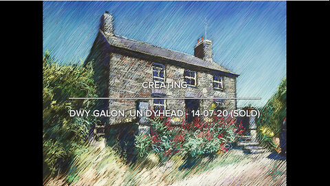
Creating Dwy galon, un dyhead – 14-07-20 (Sold)
A Commissioned Piece
This pastel drawing ‘Dwy Galon, Un Dyhead – 14-07-20 (Sold)’ is a commissioned piece. The welsh art collector already bought ‘A Day at the Beach – 16-03-19 (Sold)’. He also bought ‘Estate Oosterbeek – 17-03-15 (Sold)’ and ‘Estate Oosterbeek – 15-07-14 (Sold)’. You may call him a true collector and I am grateful every day to have my art hang in his premises. One time he mailed me with the request to do something special. He and his wife own a cottage in Wales. They must have thought of a pastel drawing in the style of the Oosterbeek pastels. Hence the request to make one. Yeah, another challenge I gladly picked up.
Something Different from Trees and Women
I never did a cottage, Usually it is either trees or women. It is often with commissions like these that I come to study things I normally do not make. Strutinizing the structure of the stones brought me a lot. Totally different from dutch bricks that are backed off in industrial furnaces. These structures are more irregular, almost organic looking. You could say that the main objective was to keep a sturdy look on the cottage. The eventual goal was to picture an iconic image of the countryside and its rural aspects. Simply fine detailing it to the max just wouldn’t do. It would not have conveyed the rough romantic edge that comes with living outside a city. That’s easier said than done by me as a city dweller. Upon my word, I never had the pleasure to be in an actual country house like this one.
Artistic Approach
Executing this one in pastel wasn’t very difficult. Quickly I got perspectives right. The stones weren’t much of a problem really. Flowery structures were. Not because of my capability of capturing them but the level of abstraction. At all costs didn’t I want them to draw too much attention. Only slightly indicate them by some swirly strokes. Hence they came late in the game, after all diagonal hatched strokes had been laid. A fun project!
Pastel drawing on Canson Mi-Teintes Touch paper (47 x 62 x 0.1 cm)
Artist: Corné Akkers
23
views
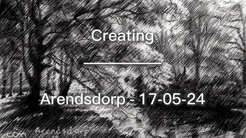
Creating Arendsdorp – 17-05-24
Sales info: original (if not sold), prints & printable - visit my website:
Website link: https://corneakkers.com/2024/05/18/arendsdorp-17-05-24/
Printable: https://corneakkers.com/product/printable-arendsdorp-17-05-24/
A Challenge Really
This graphite pencil drawing ‘Arendsdorp – 17-05-24’ an attempt to capture intertwining foliage. In my art statement to ‘Japanese Garden 1 (2014)’ I already mentioned Camille Pissarro. In my eyes he was one of the best in capturing these transitions. Not easy though. That’s why this sketch, however small it is, took me quite some time. Strange how this goes. A previous drawing ‘Mariahoeve – 03-05-24’ almost seem to draw itself but this one didn’t. Albeit it was a lot of fun searching for a good result. The trick is to capture a fairly bit part of all tonal nuances in the foliage. That is, without turning it into one big rubble pile.
Abstraction & Art
In abstraction lies art and this also counts for this one I guess. Working in monochrome there’s a lack in colour that would normally set off forms clearly. Yet another obstacle in avoiding aforementioned rubble pile. The solution was to exaggerate tonal differences a bit. Even though my hatched strokes style is perfect for depicting landscapes, a lack of tonality can kill it all. All in all a great experiment and challenge. Totally different from my last one, called ‘Beek – 09-05-24’. But that is how it goes. Often I vary and that’s much against better judgment of so-called art experts such as coaches and gallery owners. They want to to have only artists showing a distinct style. That makes it all the more fun because I don’t follow rules, even though I was a lawyer once.
Arendsdorp
The actual spot is a great little estate not far from where I live. It’s tucked away in the Benoordenhout district, here in The Hague. Not a place that you happen to stumble upon by chance. It’s a park like there are so many others around here. Some meadows, groups of trees and a few canals. Locals walk the dog there. However, when sunlight backlight trees then you got me going. Actually it’s the same park as depicted by me as ‘Park Hoog Oostduin – 14-09-22’. That’s situated more to the right of where you look at in the drawing. It’s the same park nonetheless.
Pitt Graphite Matt pencil (Faber-Castell, 14B) drawing on Winsor & Newton paper (10.5 x 14.8 x 0.1 cm)
Artist: Corné Akkers
148
views
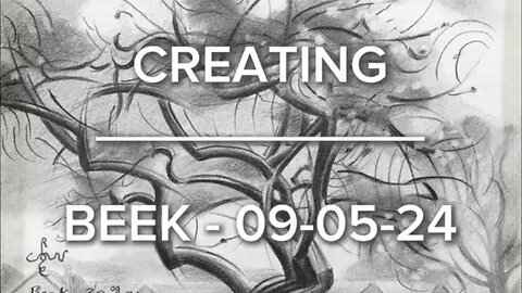
Creating Beek – 09-05-24
Sales info: original (if not sold), prints & printable - visit my website:
Website link: https://corneakkers.com/2024/05/12/beek-09-05-24/
Printable: https://corneakkers.com/product/printable-beek-09-05-24/
Liberation Day Walk
This graphite pencil drawing ‘Beek - 09-05-24’ is a bit of cubism placed in atmospheric depth. Last weekend I went out to spot some sceneries with my dad. Playground: Berg en Dal and Beek-Ubbergen. We parked on the Rijksstraatweg and walked our way up to the Filosofendal. That was last May 5th, Liberation Day. Not a particular beautiful day though. In the beginning it was cloudy and I saw dark clouds start appearing. Later that walk here comes the sun. Suddenly there was enough sunshine to took some great reference pictures of treescapes and hills. There was also Huis Wylerberg that caught my attention. Surely gonna make some of that villa in the next future. Perhaps even doing a pastel on a spot I discovered. There, in a meadow, you look right over the house and the Ooijpolder. That will be later. First, my artistic considerations as to this.
Kethel
Walking back to my car there was this beautiful willow tree with some houses in the background. Immediately I thought of a previous treescape I made, called ‘Kethel - 13-07-19 (Sold)’. This time I thought the triangular roof shapes were in perfect contrast to all things circular in the tree. Maybe this one turned into something more realistic. At least less abstract than the Kethel piece. However, there is plenty of abstraction, especially in the foliage and little branches. In the end I toned down the houses and the tree in the back on the right. They asked for too much attention. It’s always hard to finetune these things. Too much and it will be in competition with the main theme. Too less and you cannot have secondary stuff support that main theme efficiently. All in all, a nice experiment and a bit back to cubist styling again.
Pitt Graphite Matt pencil (Faber-Castell, 14B) drawing on Winsor & Newton paper (10.5 x 14.8 x 0.1 cm)
Artist: Corné Akkers
110
views
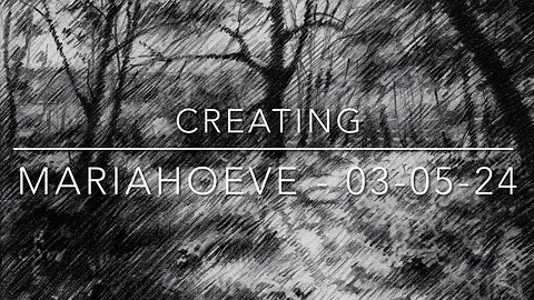
Creating Mariahoeve – 03-05-24
Sales info: original (if not sold), prints & printable - visit my website:
Website link: https://corneakkers.com/2024/05/05/mariahoeve-03-05-24/
Printable: https://corneakkers.com/product/printable-mariahoeve-03-05-24/
My Own District
This graphite pencil drawing ‘Mariahoeve – 03-05-24’ is my next landscape sketch after ‘Den Haag – Nassaulaan – 01-05-24’. This time it’s my own neighborhood, which is the district of The Hague, called ‘Mariahoeve’. Not a real gem or wandering beauty but it’s home at least. Safe, no spectacular or peculiar things going on, varied construction. There are plenty of flats but also single family homes. The exciting part is that it’s not far from the city centre and The Hague Forest. By now you must have guessed already why I didn’t draw it to date. In my art statement to Den Haag – Halstraat – 12-03-15 I mentioned Baudelaire. His cry to artists to portray daily life i cannot answer with regard to the very place where I live. There are simply too many uninteresting buildings. In fact, many districts here in The Netherlands all look the same.
A Beautiful Path
Nevertheless, doing landscapes again there was this thing gnawed at me. If it were only once to do a drawing of the place I live! After all, there are also trees, little parks and even some canals. Then I remembered a path I walk down sometimes when I go to work in Voorburg. It’s accessible from Het Kleine Loo just before soccer club ‘VUC’. Not many people dwell there, mostly dog walkers. It’s charming though, especially during Spring. Lots of cow parsley popping up. So I walked there yesterday when it was particularly good weather. Also bit of a must really. My bike had a flat tire so I had to go on foot. Therefor I took some pictures of the path. Then I could drawing at Brugman’s waiting for my bike to be repaired. So there it is, a tribute to my own Mariahoeve.
Pitt Graphite Matt pencil (Faber-Castell, 14B) drawing on Winsor & Newton paper (10.5 x 14.8 x 0.1 cm)
Artist: Corné Akkers
90
views
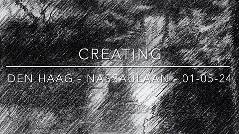
Den Haag – Nassaulaan – 01-05-24
Website link: https://corneakkers.com/2024/05/02/den-haag-nassaulaan-01-05-24/
Printable: https://corneakkers.com/product/printable-den-haag-nassaulaan-01-05-24/
A Bit of Impressionism
This graphite pencil drawing ‘Den Haag – Nassaulaan – 01-05-24’ is a bit of impressionism. For no particular reason I always associate this season with impressionist paintings and drawings of landscapes. Get yourself outdoors you’d say and sketch. Usually, during this time of year I already would have made some. However, it’s been raining quite heavily since Spring arrived but it’s getting better all the time. The weather is starting to improve here in The Netherlands. Soon I’ll be back out there drawing in a camping chair somewhere.
Nassaulaan
As to the drawing at hand I have to disappoint you. It’s not made at the very spot. There was this small exhibition ‘Children of The Hague School’ in Panorama Mesdag I intended to visit. That was a couple of weeks back and it was such a day you couldn’t decide to wear a coat or not. At the Mauritskade I decided to go for a little detour and turn right on the Nassaulaan. There was this see through with a little canal between two big mansions. I took some picture and got to the exhibition. I always like these combinations of human-made structures and nature. It gives context and contrast.
Not a Certain Style
Lately I haven’t got the cubist feel as explained in my last one, called ‘Reclining Nude after Breitner – 27-04-24’. It made me realize I have a couple of distint styles that differ from eachother. There’s Roundism, my own view on surrealism and this typical hatched strokes impressionistic style. Maybe even more. Not long ago an art critic advised me to stick with one certain style. Personally, I think that’s quite an American or commercial way of looking at things. She might be even right on this one but I feel different. What I certainly didn’t plan is to have an art carreer like many artists out there. Perhaps it’s also because I don’t want to be labelled and categorized. What I always wanted is to have a certain meta-recognition throughout all of my works. Do you think I succeed in doing so?
Graphite pencil (Sakura mechanical pen 0.5 mm, 4B) drawing on Papicolor paper (10.5 x 14.8 x 0.1 cm)
Artist: Corné Akkers
64
views
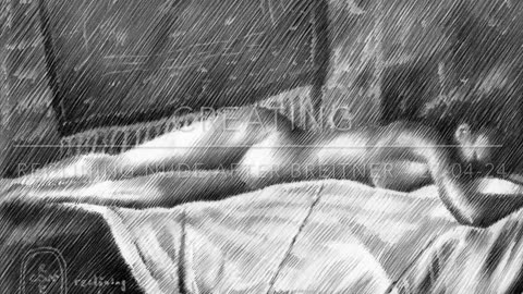
Creating Reclining Nude after Breither – 27-04-24
Website link: https://corneakkers.com/2024/04/28/reclining-nude-after-breitner-27-04-24/
Printable: https://corneakkers.com/product/printable-reclining-nude-after-breitner-27-04-24/
Breitner’s Photography
This graphite pencil drawing ‘Reclining Nude after Breitner – 27-04-24’ is based on a photograph Breitner took himself. He was an avid amateur photographer and based many of his artworks on pictures he made. Not the first time I delved into his photos. Especially the ones he didn’t use himself for paintings I am after. You’ll probably remember my Geesje Kwak series. A couple of years before that I made Nude after Breitner’s Photograph – 22-04-17 (Sold)’. The latter was fun to do. However, I haven’t got the cubist feeling at this moment. That’s because I am caught up by a highly detailed oil painting at this moment. After two realist pastels I made last week I didn’t have much inspiration for innovation. Instead, just practising my fingers with graphite pencil and then suddenly I got an idea.
Hatched Strokes
For no particular reason I thought of ‘Geesje Kwak – 25-08-21 (Sold)’. That one I executed in my hatched strokes style using a mechanical pen. What if I do that using a Faber-Castell Pitt Matt 14B pencil this time. Thoses hatchings are subtle and therefor can look a bit weak tonally. I wouldn’t have that with this very dark graphite pencil. This endeavor became the core of this drawing. No cubism this time but a kind of impressionism. The tonality looks similar to ‘Duivelsberg – 25-12-23’. Completely different subject though. By the way, this photo is from 1890. It makes me realize how quick time flies. The female form reclining seems so tangible though. I got the same feeling with kimono girl Geesje. A full century between her posing and my gaze at her. Will people have the same regard of my artworks over 100 years from now?
Graphite pencil (Faber Castell Pitt Graphite Matt pencil 14B) drawing on Talens Bristol paper (21 x 29.7 x 0.1 cm)
Artist: Corné Akkers
89
views
2
comments
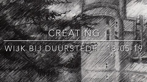
Creating Wijk bij Duurstede - 13-05-19
Available as original (if not sold), prints & printable. Visit my website for more information:
Website link: https://corneakkers.com/2019/07/05/wijk-bij-duurstede-13-05-19/
Printable: https://corneakkers.com/product/printable-wijk-bij-duurstede-13-05-19/
In the Middle of the Netherlands
I came to visit Wijk bij Duurstede, a small city near Utrecht. Just outside the city center there is this park towards the river Lek. When you enter it you immediately see the park is actually a former bastion. In the middle there are the remnants of a once bigger castle Duurstede. It’s everything one can expect from a medieval castle. There’s a moat, a keep and a perfect preserved round Burgundian tower. Not the first time I’ve been there but the first time there wasn’t a lot of sunshine. As a discipline of the light I need the atmosphere around objects to be bright and dark.
Majestic Things
So there it was, the second time there was plenty of sun and for that matter also cast shadows. Next, let me tell you about a challenge each artist faces trying to capture majestic things. Buildings, trees, castles and what not can look very smallish if rendered with harsh contour delineations. The trick is to put them into context with surroundings. Therefor I didn’t fine detail the tower in order to keep it at some distance. By doing less I tried to make it appear to be larger, taking Monet’s message (Rouen series) to heart.
Hatched Strokes
Just as in the previous drawing of Veere I kept this one in my hatched strokes style. I experienced this suits me best to do landscapes and cities with. Especially in small format like A5 and A6 forms look not too small as explained in the previous paragraph. One could say these have become a style in their own right. Surely way different from all things cubist and surrealist I create as well.
Graphite pencil drawing (Pentel 0.5 mm, 3B) on Canson Bristol paper (10.5 x 14.8 x 0.1 cm – A6 format)
Artist: Corné Akkers
30
views
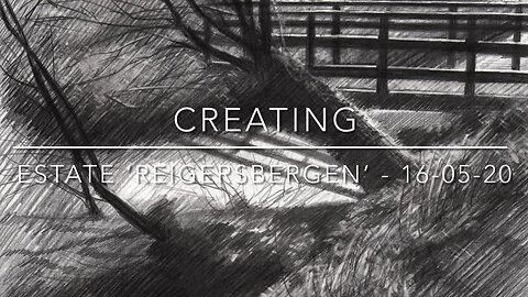
Creating Estate ‘Reigersbergen’ – 16-05-20
Printable: https://corneakkers.com/product/printable-estate-reigersbergen-16-05-20/
Product: https://corneakkers.com/product/estate-reigersbergen-16-05-20/
Estate Reigersbergen
This graphite pencil drawing ‘Estate ‘Reigersbergen’ – 16-05-20’ is a bit of impression, executed in my hatched strokes style. My mind is back on landscapes again since my last drawing ‘Model Session – 14-05-20’. I liked laying down these hatchings in the female form so why not in trees again? You can spot them returning in Marlot – 11-04-20 but that was a small A6-size one. De Hofvijver – 20-03-20 (Sold) is A4-size and that is what I longed for this time. Besides that, there’s not something to do really since the virus started to kick in. Don’t worry, I have not taken ill, yet. Still not teaching though and therefor l trade lockdowns for landscape so-to-say.
Corona Days
These Corona days I wander about the region like I am used to. Nothing changed in this respect and it’s something I am used to during Sprintime. Moreover, I am more than happy that we in The Netherlands have at least some freedom of movement. Besides that the end of our ‘intelligent lock down’ is in sight. Soon I can start to teach but first draw this one. I was attracted by the slanted angular structures of the willow trees. They suit my opposite hatched strokes quite nicely. It represents a spot close to where I live, called ‘Estate Reigersbergen’.
Favorite Spot
In the distance the treeline belongs to Huis Ten Bosch, where king Willem-Alexander van Oranje-Nassau and his family reside. This estate ‘Reigersbergen’ is one of my favorite spots in The Hague. It has all a man could wish for, woodlands, pastures, cows, forests and parks. Just around the corner to where I live. That’s the wonderful part of living here in The Hague.
Graphite pencil drawing (Pentel 0.5 mm, 3B & Conté graphite pencil 4B) on Canson Bristol paper (21 x 29.7 x 0.1 cm – A4 format)
Artist: Corné Akkers
27
views

Creating Kethel - 13-07-19 (Sold)
Website link: https://corneakkers.com/2019/07/13/kethel-13-07-19/
Printable: https://corneakkers.com/product/printable-kethel-13-07-19/
Tree in Bloom
When I returned to my car from my trip to Kethel, Schiedam, Netherlands, I saw this beautiful tree in bloom. Sometimes you look for grand things and the little all of a sudden pop into your eyes when least expected. The actual tree was in no interesting area but the very shape struck me by lightning. I took a picture and decided to do it only now (in summer). Live sketching can be overrated. It so happened that I do not have some pencils, paper and a camping chair at hand. Furthermore, I regularly see so many motifs that I cannot draw all at the very spot. From the moment I took this picture I planned to do this anyway, live or not.
Encapsulated
The last time I visited this beautiful little village was in Spring when I drew my first graphite pencil drawing ‘Kethel – 22-04-19’. Unfortunately Kethel has been completely surrounded by apartment buildings. The crazy thing is that first I could not find it at all. I had to climb the roof of the local supermarket in order to spot the top of its bell tower. Then I saw it was completely encapsulated by modern architecture. The village has managed to keep its original character though. Now looks like an open-air museum that is cherished like a dear gem.
Roundism
I tried to capture the flow of the flowering tree and of course in my roundish style. I thought of a couple of recent landscapes I did in that style. Beek – 11-06-19 was the last. Finally I feel this one hits the right spot. Is more profoundly roundism and it expresses exactly what I tried to convey. That was a rhythym of broken curves, thick and thin. Lucky for me someone else catched my drift so I sold it quickly.
Graphite pencil drawing (Pentel 0.5 mm, 3B) on Winsor & Newton paper (10.5 x 14.8 x 0.1 cm – A6 format)
Artist: Corné Akkers
15
views
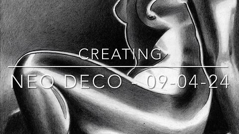
Creating Neo Deco – 09-04-24
Website link: https://corneakkers.com/2024/04/10/neo-deco-09-04-24/
Printable: https://corneakkers.com/product/printable-neo-deco-09-04-24/
Solarised Look
This graphite pencil drawing ‘Neo Deco – 09-04-24’ is the first one after a couple of pastel drawings. Seized by my currect oil painting in progress I kept the posting pace going by some live model sketches. Meanwhile I had this piece under way and I didn’t have a clue what to do with it. So each time at Brugman’s where I teach I worked at it, bit by bit. Originally I had something surrealistic in mind. Soon I changed the set-up and decided to opt for yet another solarised look. Actually, my last one ‘Sands Time – 23-03-24’ looks a bit like this one. The thing is that I didn’t want to loose the brilliant shadowy patterns on the model’s body. Some motifs and especially the lighting are great enough to only celebtrate these by a bit artistic enforcement.
Willy Zielke
The drawing is inspired by a 1930s photo made by Willy Zielke. Lately I have been browsing again online looking for pictures from the art deco era. A couple of pictures one night stood out because of the clean cut lighting he used. Certainly my cup of tea so to speak. My addition to the scene is the aforemention solarization and thick linear contour delineations. My aim was to create contrasts between soft tonal transitions and abrupt ones. I also let the body vaporize into the negative space. You can see that in the left arm, above her right breast and in her leg. This way all contrasts are present. There is light versus dark, soft versus harsh transitions and angular versus roundish. Personally, I like the hair locks the best. They look funny and strange in solarized forms.
Graphite pencil (Faber Castell Pitt Graphite Matt pencil 14B) drawing on Talens Bristol paper (21 x 29.7 x 0.1 cm)
Artist: Corné Akkers
171
views
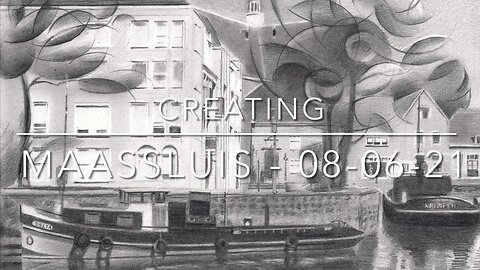
Creating Maassluis – 08-06-21
Sale info: original (if not sold), prints & printable - visit my website:
Website link: https://corneakkers.com/2021/06/08/maassluis-08-06-21
Printable: https://corneakkers.com/product/printable-maassluis-08-06-21/
An Incredible Search
This graphite pencil drawing of Maassluis is an inbetween exercise. I find myself in this incredible search for capturing the cubist essence of Geesje Kwak in oil. Depicting this city is somehow similar in design and ambition though. Lately I am fantasizing about combining ‘realism’ or whatever realism might mean to an artist and my personal roundism style. I find myself curiously related to the buddhist at the hotdog stand ordering one with everything. Maybe it has something to do with having explored many styles such as realism, impressionism, cubism and then some. Why wouldn’t I want exactly that: one with everything?
Maassluis
Even though Maassluis is not far away, I never visited the place until some years ago. That is when I made my first drawing of the place. The mindset I had was to render the trees cubistically. I kept other elements such as the buildings, ships and water realistic or impressionistic at least. This way the cubist tree becomes an integral part of the realistic depiction rather than an annoying deviation from it. That is my aim at least and it is for the spectator to judge.
Progression
Surely I can see I progressed in techniques and artistic conception from then on. Drawings from the recent past look more elaborated like Park Leeuwenbergh. The reason can be found in either taking more time and patience to work things out or getting conservative. By the latter I mean that each style can start with a rough edge. As time goes by one tends to fine polish it, extending the possibilities within that certain style to the max. That is, until everything has been squeezed out and becomes almost rendered in a reserved way. Obviously I hope that will not be the case in the current situation I am in. I like to progress from here and pick up the joy of sketching and find stuff anew. Anyway, that will be for and be judged upon later. First I have to return to Geesje Kwak and start a new drawing to kill the time when I am not behind my easle.
Graphite pencil drawing (Pentel 0.5 mm, 3B) on Talens Bristol paper (21 x 29.7 x 0.1 cm - A4 format)
Artist: Corné Akkers
26
views
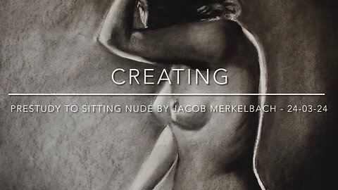
Creating Prestudy to Sitting Nude by Jacob Merkelbach – 24-03-24
Website link: https://corneakkers.com/2024/03/25/prestudy-to-sitting-nude-by-jacob-merkelbach-24-03-24/
Printable: https://corneakkers.com/product/printable-prestudy-to-sitting-nude-by-jacob-merkelbach-24-03-24/
Jacob Again
This charcoal and pastel drawing ‘Prestudy to Sitting Nude by Jacob Merkelbach – 24-03-24’ is made under two hours. On a whim really because this afternoon I went to Brugman Art to teach model sketching. 7 enthusiasts but not experienced persons I wanted to give an example what to expect. As to drawing I also want to show students how I personally render the human figure. So I went early in order to get ready for the session and to set up a sketch. Of late I have disccovered the works of Jacob Merkelbach I have mentioned before. In fact, my last drawing was based on one of is beautiful photos. The pose of the woman shown in the picture was gorgeous and the posture simple at the same time. Doable under an hour I had before the group arrived.
Under Two Hours
Actually, I was finished doing the pose and the right proportions under half an hour. So I had the opportunity to show what I’m all about: tonality. I had only charcoal available. Thus the setup remained a bit pale. However, back home I decided to spend another half an hour to darken things up with Conté carré noir. Somehow I thought this might as well serve as a prestudy for a graphite pencil drawing. As such that always is meant as study for an oil painting. Obviously a prelude to a prelude more or less. It’s jolly good fun to do and show these sketches. See what the contrast in quality is between stuff I worked on for hours and those drawn quickly. Which works do you prefer?
Popular on Social Media
Strangely this classical or should I call it academical work is popular on social media. Take ‘Model Session – 23-01-24’ for example. According to Facebook this pastel became the most popular watched reel of late. Duly noted but I’m a bit ashamed because of the unpretentiousness of these drawings. There is nothing to convey, only beauty and tonal skills. What do you think, need I worry or carry on? A guilty pleasure, most definitively!
Pastel drawing on paper (49.8 x 64.6 x 0.1 cm)
Artist: Corné Akkers
223
views
3
comments
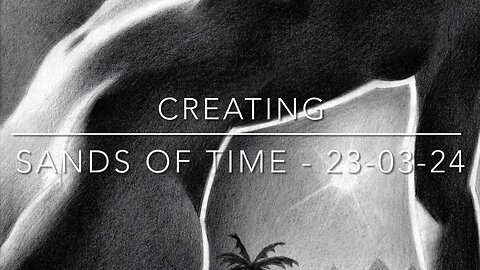
Creating Sands of Time – 23-03-24
Website link: https://corneakkers.com/2024/03/23/sands-of-time-23-03-24/
Printable: https://corneakkers.com/product/printable-sands-of-time-23-03-24/
Endlessness
This graphite pencil drawing ‘Sands of Time – 23-03-24’ follows exactly one month after my last one ‘Cleopatra – 23-02-24’. They both are part of my series ‘Out of Egypt’ laid to rest for a couple of years. Lately I had some ideas or rather a kind of vision entering my mind. Perhaps more a spiritual journey after many meditations on the subject ‘infinity’. Isn’t that the artist’s job, to show exactly that? By now you ought to know my fulminations with regard the state art is in today. With little to convey many expressions of art seem only meant to decorate lush living rooms these days. I always associate Egypt and its art as way to transfer feelings of endlessness and the spiritual. I’ve never been in a desert before. However, sand dunes as far as the eye can see seem both freightening as well as enchanting.
Jacob Merkelbach
Well now, there’s the final result which is the spiritual as stated above. The initial cause is yet another great reference picture taken by Jacob Merkelbach. That’s why we call it the artistic motif. A motif is the instigant causing an artist to yearn for something else. That’s the start of soul searching deep inside to see what ideas are spawn from it. In my case it’s all about the tonality. I often discuss the realm of contrasts with students. The are part of ‘the implicate order’ ruling over phenomena and stuff people give meaning to. However, contrast is what makes things come alive. Water versus drought, light versus darkness. Hence my weapon of choice: black and white als element born by eternity to be portrayed by them. Can you dig it? Into the sand, that is.
Graphite pencil (Faber Castell Pitt Graphite Matt pencil 14B) drawing on Talens Bristol paper (21 x 29.7 x 0.1 cm)
Artist: Corné Akkers
99
views
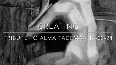
Creating Tribute to Alma Tadema – 16-03-24
Website link: https://corneakkers.com/2024/03/16/tribute-to-alma-tadema-16-03-24/
Printable: https://corneakkers.com/product/printable-tribute-to-alma-tadema-16-03-24/
Another Tribute
This graphite pencil drawing ‘Tribute to Alma Tadema – 16-03-24’ is dedicated to a painter causing a stir in England. That’s more than hundred years ago though. Not the first time I did that. Back in 2021 I did one including my regular model reclining under the mediterranean sun. Last year I did Psyche & Amor – 23-05-23 being an elaboration of that drawing. Isn’t that enough, you’d say? No, certainly not and below I will explain why.
Something Rotten
Something is rotten in the state art today or is it? Well, perhaps that’s too baldly put. In my statement to ‘The Infinite Waves of Eternity – 06-02-24’ I already spoke of a rubble pile of nonsense in this post-modern art world. Craft has left art and everythings goes, so it seems. Take tonal scales for example. Back in the day artists trained themselves in producing such a scale the first year in art school. With this drawing I want to demontrate what suitable tones can do and support the theme of an artwork. What do you think? A bit old-fashioned? Do you like Zene art, wall art or any other decorative work in general? Please let me know my sending me a mail.
Not the Ultimate Kitsch
Therefor I dedicate this drawing to someone who was accused of creating the ultimate kitsch. Cookie jar or cigar box art they call it. Kitsch or not, I’ll keep on referring to the beauty great artists sought to create throughout thousans of years. Lourens had a bit of a sweet tooth, that’s for sure. Surely great and original art though. By the way, the piece is inspired by a smashing reference picture by Jacob Merkelbach, called ‘La Petite Mélancholie’. So, this is also in honor of him. Some final words: the less skilled artist become, the more skills I will display.
Graphite pencil (Faber Castell Pitt Graphite Matt pencil 14B) drawing on Talens Bristol paper (21 x 29.7 x 0.1 cm)
Artist: Corné Akkers
174
views
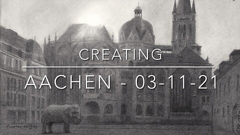
Creating Aachen - 03-11-21
Sales info: original (if not sold), prints & printable visit my website:
Website link: https://corneakkers.com/2021/11/03/aachen-03-11-21
Printable: https://corneakkers.com/product/printable-aachen-03-11-21/
Visiting Albrecht Dürer
Sunday last October 17th in Aachen my parents and I visised the once-in-a-lifetime exhibition of Albrecht Dürer and contemporaries. Crime scene: Suermondt-Ludwig Museum at Aachen, Germany. Aachen always is a enchanting place to visit with its Aachener Printen and of course to follow Charlemagne’s footsteps. They are scattered all over the place and imprinted in the Aachener Dom and the Aachen Cathedral Treasury (Domschatzkammer). When in Aachen I never went to the very museum before. It resides at the outskirts of the old centre and it is not a logical place to visit except for special exhibitions. And so there was one! Never before were there so many of his works in one place after he died. Do you want to know a secret? I was a little bit jealous of his drawing skills. How was he able to draw such thin lines?
Aachener Dom
Before visiting the museum we went for a little stroll around the cathedral, also not to miss out on those Printen! Walking full circle there it presented itself: a lovely side view I remembered from earlier trips in 1991 and 2004. Dürer’s works still messing with my head I recalled he did a drawing of the cathedral too (in 1520) I could see from his drawing he held a higher vantage point and farther away. The fun part is it looks exactly the same 500 years ago as it still stands today. There was a bigger tower on the Palatine Chapel though.
Artistic Approach
Surely I had to do my best because, compared to Dürer’s works, I have broad shoulders to stand on. Studying his very drawing I saw he had a rather linear approach. That is where I could beat him at his game. He did not know anyting about impressionism and so I rendered my graphite pencil drawing in this style. It is a perfect way to suggest lots of details without actually having to depict them. Throwing in details is a precarious matter anyway and easily leads to a messy impression. The sun was just above the cathedral’s nave and so the mass of the architecture appeared dusky anyway. It was perfect for my impressionistic aim.
The Suggestion of Lots of Details
With the refined graphite pencil techniques of Geesje Kwak – 08-10-21 still in my fingers this one was not very difficult. It took a lot of time though. Many people would think drawing all those details takes pain staking skills. Actually it is the absence of details and only the suggestion of them that is difficult. What is need is a subtle draftswork in order to keep an even tonality all across the building structure. That takes time and muscle control.
Abul-Abbas
Low and Behold! On the actual square in front of the cathedral I thought I saw Abul-Abbas, Charlemagne’s elephant for a moment. What I liked about those Germans the most is that they worship their Elephant God. They even released an air balloon in the shape of an elephant. On its side there was this promotional poster with Dürer on it. How thoughtful! Therefor it was more than justified to incorporate them both in my drawing.
Graphite pencil drawing (Sakura 0.5 mm, 4B) on Talens Bristol paper (21 x 29.7 x 0.1 cm) - A4 format)
Artist: Corné Akkers
12
views
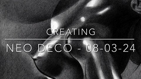
Creating Neo Deco – 08-03-24
Website link: https://corneakkers.com/2024/03/09/neo-deco-08-03-24/
Printable: https://corneakkers.com/product/printable-neo-deco-08-03-24/
Interesting Synthesis
This graphite pencil drawing ‘Neo Deco – 08-03-24’ is another homage to the realm of art deco. To be precise, I dedicate this one to photographer Walter Bird whose series ‘Beauty’s Daughthers’ is just breathtaking. Yet again because I already was inspired by some of his works as motifs for my drawings. In fact, last month. Thus, the Neo Deco series becomes an interesting synthesis of elements of art deco, cubism, roundism and surrealism. However, to some motifs I add more added value than others. Last one of Cleopatra came more from my mind than this one. Sometimes you’ll simply have to let it shine in its original splendor. Serving as a service-hatch from the Deco epoque to modern times, I take comfort in that.
Adaptations
It needed a bit of cubist styling and some abstraction. Especially in the highlights sections I skipped visible pores exposed by the oiled skin. Last but not least I deviated from the picture in the end. The head and neck looked a bit elongated compared to her chest. That could have been caused by the model leaning over towards the camera and warpness created by the camera lens. In addition, people were a shorter back in the day so the head-body ratio was a bit different. The more reason I made the head a bit smaller. The region between shoulder and jaw I also made a bit darker. Unfortunately an interesting swirl I created in the beck became an impediment. Such is life for an artist now and then.
Cunning Plan
As to lighting this Neo Deco variety looks a bit like ‘Cubist Study after Lauren Albin Guillot – 18-10-23’. Yet another great photographer from the same era. These chiaroscuro lightings are my favorite. They inspire me to take pictures of my models like that. There’s a cunning plan in my mind lingering about though. My secret wish is to sell a lot of prints and printables of this one and buy myself a big studio with lots of equipment. Then I can tweak lamps and light better in more space than I now have in my small apartment. Would you help me executing my plan?
Graphite pencil (Faber Castell Pitt Graphite Matt pencil 14B) drawing on Talens Bristol paper (21 x 29.7 x 0.1 cm)
Artist: Corné Akkers
185
views
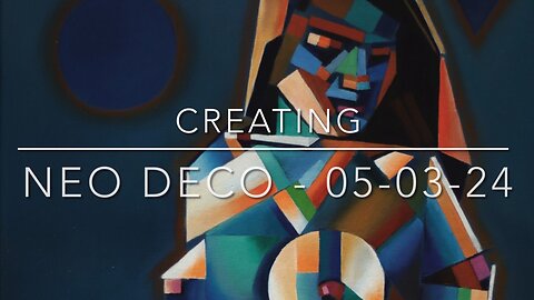
Creating Neo Deco – 05-03-24
Website link: https://corneakkers.com/2024/03/05/neo-deco-05-03-24/
Printable: https://corneakkers.com/product/printable-neo-deco-05-03-24/
Back in 2014
This oil painting ‘Neo Deco – 05-03-24’ is an elaboration of my pastel drawing ‘Cubist Nude – 28-03-14’. One I was bound to elaborate at some point. I remember I made that one on a whim at Brugman, Voorburg where I teach. Probably a quick sketch before art class. Sometimes those are the best, feeling free to experiment. Now, 10 years later it was about time to set it loose on linen. Little did I know working on a larger scale offers many new challenges.
Scaling Up, Troubles Bound
You see, scaling up this artistic motif didn’t satisfied me and it wasn’t that much bigger. Canson pastel paper is 50 x 65 cm and this painting measures 60 x 80 cm. However, after transferring basic proportions I thought the result was looking rather meager. Or was the result looking rather similar to the pastel drawing I already made in 2014? I don’t know really. Such things just happen when you use a motif a second time around. All bets are off. The trick is to find something new, in spite of the attraction of the initial drawing. There was some added value to be found.
Enter Color
Terrific to see how color also influences form. This female form demanded more forms this time but these weren’t supported by the monochromy I had in mind. Initially I had planned to execute it in blue only but it didn’t work for me really. Enter color and that always means a whole new ballgame. Blue needs orange. These two are complementary vibrant but also a bit boring, so green and pink were added. After a while I realized I had to change, even add forms as well. That was necessary balance all the different colored patches. Hence another jigsaw puzzle like the struggles I face completing ‘Nina – 12-10-23’. All-in all I’m happy with the balance in saturated and non-saturated colours.
Oil on linen (60 x 80 cm)
Artist: Corné Akkers
71
views
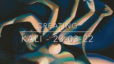
Creating Kali – 23-03-22
Website link: https://corneakkers.com/2022/03/23/kali-23-03-22/
Printable: https://corneakkers.com/product/printable-kali-23-03-22/
Enter Kali
Enter Kali The Destroyer. This oil is an elaboration of an earlier graphite pencil drawing ‘Roundism – 26-04-16 (sold)’. At first I planned to do this this oil before my oil Vesna 14-03-22. However, because of current events in the Ukraine the latter came first because I felt it was so urgent. Perhaps there is something good and something not so successful in each work I created throughout the years. Aforementioned drawing I consider to be the one of the better ones I made. Needless to say I sold it quickly. Surely I felt like doing this one in oil one day but never found the time to do so. Must have been my head brimming over with lots of ideas to be captured on paper first.
Wife of Shiva
Maybe you know the story of the goddess Kali, wife of Shiva. For those who do not, just click one of the aforegiven links. The title came rather intuitively, associating the multiple arms with her obviously. She is not the first and last I made. Back in 2018 I did ‘Roundism – 04-08-18 (sold)’. Women with multiple arms must be a popular item since I sold that one as well. Anyway, I guess I am attracted to goddesses who both destroy and serve as a protective mothergoddess. She is also the preserver of nature. The reference picture I used is an old one from the 1920s. The chiaroscuro play of light and darkness is conducive to the association with Kali of course.
Multiple Arms in Color
Back then in 2016 I found the picture of the single arm streched out to the right a bit ‘tiny’. There wasn’t much to be seen in the upper central part except for a big black void. That’s how I came to Kali multiple arm theme, filling up the gap. My subconsciousness could have guided me to her, who knows? The challenge was to transfer the drawing into an oil, choosing a suitable color scheme. The palette I still had from previous paintings still hadn’t dried up. From an economical point of view I thought I’d better finish what was left over. That is why the blue of the Ukrainian flag is all around in the negative space of this one. There are some hints of yellow I used before but also the rose-rouge-apricot plains that came from previous Risque paintings.
Oil on linen (60 x 80 cm)
Artist: Corné Akkers
34
views
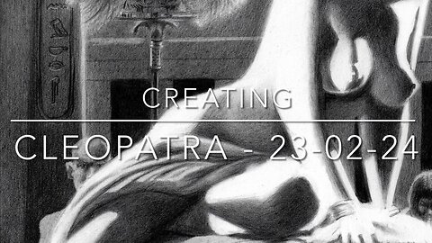
Creating Cleopatra – 23-02-24
Sales info: original (if not sold), prints & printable). Visit my website:
Website link: https://corneakkers.com/2024/02/23/cleopatra-23-02-24/
Printable: https://corneakkers.com/product/printable-cleopatra-23-02-24/
More than Cubism and Roundism
This graphite pencil drawing ‘Cleopatra – 23-02-24’ refers to a work under the same name I made back in 2018. That year I started my ‘Out of Egypt’ series and in retrospective I can see it wasn’t without a reason. Art Deco is on my mind for quite some time now under which flag I can show more. Cubism is very fine and I even forged my own style ‘Roundism’ out of it but I want more. Egyptian art I consider a big and heavy precursor to Art Deco. Obviously the latter was influenced directly after the discovery of Pharaoh Tutankhamun’s tomb. Surely, those Egyptians had style and swag. This drawing I plan to serve as a bridge between great artistic eras divided by oceans of time.
Hollywood
The reference picture was from the 1920s I believe and shows hefty quantities of light and dark. Also called ‘chiaroscuro’ the phenomenon could be characterized by abrupt shifts in tonal values. Through these a certain dramatic effect is created; meat for the beast I’d say! Next, why Cleopatra? Something occured to me, Lawrence Alma Tadema’s paintings of the ancient world served as an inspirational source for Hollywood. Without his artworks movies like Ben Hur, The Ten Commandments by Cecil B. DeMille and Gladiator wouldn’t have been created.
Back to Egypt
At the start of the drawing I planned for some pareidolia effects. Then I saw the head of the Sphinx in her groin. However, I decided not to follow that trail. It was only very faint and proportions weren’t that ideal. The rugged carpet the model is leaning on wasn’t inspirational either. All of a sudden the drawing of 2018 popped into my head. From there it wasn’t difficult to create a small Egyptian world around her, inclusive a viper. Has she been bitten yet?
Graphite pencil (Faber Castell Pitt Graphite Matt pencil 14B) drawing on Talens Bristol paper (21 x 29.7 x 0.1 cm)
Artist: Corné Akkers
139
views
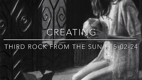
Creating Third Rock from the Sun – 15-02-24
Website link: https://corneakkers.com/2024/02/16/third-rock-from-the-sun-15-02-24/
Printable: https://corneakkers.com/product/printable-third-rock-from-the-sun-15-02-24/
My Compliments
This graphite pencil drawing ‘Third Rock from the Sun – 15-02-24’ I wanted to create for a long time. However, caught up in some projects in oil I had some time to think about the execution. First, let me start with complementing model Nina and her photographer. You probably know her from the series I made last year. If you like you can visit her website. She had a new photoshoot published and I saw one photo that got my attention. What a great lighting and thanks for letting me use it!
Rembrandt’s & Vemeer’s Legacy
Living in The Netherlands it’s imposssible to escape the legacy of Rembrandt and Vermeer. Surely not the inventors of chiaroscuro effects but they took lighting to another level. So no surprise there they are world famous. Consequently I became fascinated by the light too. So much so that I dedicated almost my entire work to it. So there it was, a great model, great lighting and now a theme. Deviating from the picture I felt was necessary. It always does because sheer copying isn’t my bag. This was the first time after ‘Neo Deco 18-10-23’ I used bristol paper again. I had it in me to combine that to the slightly angular approach I used in ‘Nina – 12-09-23’. This way I could use all the fantastically highlighed elements without the necessity to invent nifty cubist forms.
The Whole World in Your Hands
As always, whilst drawing I came up with an idea. Instead of the motorized house buddy she was holding in her hands I thought of mother earth. If you have reached this section of my art statement you most certainly care for environmental issues as well. Sometimes you have to listen to the universe. And so it came to be halfway through the drawing I listen to a news item on sea level rise. As artist I can be powerful and highlight that topic for a change. Not the first time though and perhaps you remember ‘Yeast – 18-09-19’. There you have it, the whole world in your hands AKA The Third Rock from the Sun. Threat her carefully!
Graphite pencil (Faber Castell Pitt Graphite Matt pencil 14B) drawing on Talens Bristol paper (21 x 29.7 x 0.1 cm)
Artist: Corné Akkers
25
views